1. Pale Oak & White-Oak-Inspired Floors
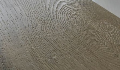
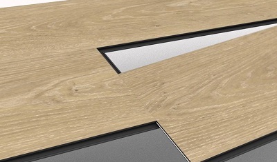
One of the most forgiving pairings for light or cool gray walls. Pale wood keeps the room bright, adds natural texture and works well in Scandinavian, coastal, modern organic and minimalist interiors.
Gray walls work with almost every wood-floor family, but the best pairing depends on undertone, contrast and room light. Cool gray walls usually coordinate with pale oak, white-oak, ash or greige wood tones; warm gray and greige walls usually feel more balanced with natural oak, honey oak, medium brown or walnut. For bright, flexible interiors, choose light-to-medium wood. For a more dramatic room, pair light gray walls with dark brown or walnut tones.
For flooring importers, private-label brands and project buyers, 3C-Floor can translate these color directions into wood-look SPC, LVT or WPC flooring programs with coordinated décor, texture, plank format and packaging.
Light oak, natural oak, greige wood, medium walnut and dark brown can all work with gray walls. The safest approach is to match undertones first: pair cool gray walls with cooler or neutral woods such as white oak, ash, gray oak and greige; pair warm gray or greige walls with warmer woods such as natural oak, honey oak and walnut. Then use floor depth to control the mood—light floors make a room feel more open, while dark floors create stronger contrast and visual weight.
Two walls can both be called “gray” and still behave very differently next to a wood floor. Look at the wall beside a plain white sheet, warm wood furniture and cool metal. Blue or violet casts indicate a cooler gray; beige, taupe or brown casts indicate a warmer gray. If the wall changes dramatically from daylight to evening light, treat it as a lighting-sensitive neutral and approve the floor in the actual room.
Blue-gray, steel gray and many crisp contemporary grays usually look cleanest with pale oak, ash, cool beige, greige or restrained gray-brown flooring.
Gray with beige, taupe or brown undertones is easier to coordinate with natural oak, honey oak, warm medium brown and walnut.
Light gray is flexible. Pair it with pale wood for an airy look, medium oak for balance, or dark walnut for a sharper high-contrast interior.
Dark walls already add visual weight. Light or natural wood floors usually keep the room from feeling compressed, especially where daylight is limited.
Instead of choosing from hundreds of isolated floor samples, narrow the decision to a wood-tone family. This makes it easier to build a coherent retail assortment or project finish schedule.
One of the most forgiving pairings for light or cool gray walls. Pale wood keeps the room bright, adds natural texture and works well in Scandinavian, coastal, modern organic and minimalist interiors.
Warm natural oak offsets the coolness that some gray rooms can develop. It is especially effective with warm gray, greige and soft neutral walls where the goal is a welcoming residential feel.
Greige wood can bridge warm and cool palettes. The key is contrast: when both walls and floors are gray, make one clearly lighter, darker or warmer so the space does not flatten into one value.
Medium brown gives gray walls warmth without the visual weight of very dark floors. Walnut directions are useful in premium residential, hospitality and office spaces that need a richer material story.
Dark floors can make light gray walls look brighter and more architectural. They work best where the room has enough light and where ceilings, trim, furniture or textiles add visual relief.
Whitewashed and very pale wood looks can make medium gray walls feel softer and more spacious. Add warmer textiles or furniture if the room starts to feel overly cool.
Use this matrix as a shortlist, then confirm the final floor with a large sample under the project’s real lighting.
| Gray Wall Direction | Wood Tones to Test First | Visual Effect | Use Caution With | Good Applications |
|---|---|---|---|---|
| Cool light gray | Pale oak, white oak, ash, greige, light gray-brown | Clean, open, contemporary | Very orange/yellow wood if the contrast feels abrupt | Apartments, bedrooms, modern retail, offices |
| Warm light gray / greige | Natural oak, honey oak, warm beige oak, medium walnut | Soft, warm, residential | Blue-heavy gray flooring that can disconnect from the wall | Homes, hospitality, rental housing, living areas |
| Medium neutral gray | Light oak, natural oak, greige, medium brown | Balanced and flexible | Floor and wall with nearly identical value | Whole-home collections, mixed-use projects |
| Charcoal / dark gray | Pale oak, warm natural oak, light greige | High contrast, lighter floor plane | Very dark flooring in small or dim rooms | Feature spaces, showrooms, hospitality, bedrooms |
| Light gray with strong daylight | Natural oak, walnut, smoked brown, deep greige | More depth and architectural contrast | Glossy dark floors that amplify reflections and dust | Large living rooms, offices, premium residences |
Wall undertone is only one variable. Floor color is seen across a large horizontal surface, so window direction, artificial lighting, furniture mass and plank scale can shift the result.
For residential product programs, see how 3C-Floor organizes SPC, LVT and WPC by room and use case on the residential vinyl flooring guide.
The search phrase “gray walls and wood floors” is mainly about appearance, but a sourcing decision also needs a product structure. 3C-Floor manufactures resilient wood-look floors rather than solid hardwood, so the design direction can be specified independently from the core and installation system.
Useful when buyers prioritize a rigid core, dimensional stability and click-installation programs. Oak, walnut, gray and other wood-look directions can be developed on the rigid platform.
Useful for design flexibility across plank and tile formats with click, glue-down or loose-lay approaches depending on the selected construction.
Often selected where a thicker, comfort-led vinyl plank structure is part of the sales story, especially in residential and hospitality-oriented collections.
When building a collection for gray-wall interiors, compare décor families side by side rather than approving one isolated plank. The 3C-Floor pattern library provides additional wood and surface directions.
A distributor does not need ten nearly identical gray planks. A stronger collection covers distinct room moods while keeping enough separation between SKUs to help customers choose quickly.
| Collection Role | Recommended Color Direction | Wall Pairing | Surface Direction | Commercial Purpose |
|---|---|---|---|---|
| Airy neutral | Pale / white oak | Cool or medium gray | Low-gloss, fine wood grain | Small homes, apartments, Scandinavian / modern retail stories |
| Mainstream natural | Natural oak | Warm gray / greige | Moderate embossing, controlled knots | Broad residential appeal and easy room coordination |
| Bridge neutral | Greige / smoked oak | Warm or cool gray | Matte, low-contrast grain | One SKU that works across mixed neutral palettes |
| Premium warm | Walnut / medium brown | Light neutral gray | Deeper grain or EIR direction | Premium residential, boutique hospitality, executive spaces |
| High contrast | Deep smoked / dark brown | Light gray | Matte to reduce glare | Feature interiors and high-impact showroom presentations |
If the final floor will be floated, include underlayment in the system decision rather than treating it as an afterthought. Review flooring underlayment options alongside the selected plank structure.
Color names are too broad. Compare actual undertone and value under the same lighting.
Without value or temperature separation, the room can lose depth. Add contrast in tone, texture or furnishings.
Wood pattern repeats, knot frequency and plank-to-plank variation become more obvious once the floor covers a room.
The wall and floor may coordinate while fixed cabinetry creates a third, conflicting wood temperature.
The same décor can appear on different SPC, LVT or WPC constructions. Installation, traffic and project needs still determine the correct floor system.
For B2B repeat orders, lock the approved décor reference, surface, thickness, wear layer, backing, plank size and packaging details—not just “light oak.”
A floor chosen to match gray walls still has to perform as a flooring product. For OEM or project purchasing, approve the visual on a finished plank—not only a décor-film image—and confirm the construction that will be repeated in production.
For a broader view of design-led rigid core selection, compare current SPC wood and stone visual options before requesting samples.
Light to medium wood tones are the most versatile with gray walls. Pale oak, natural oak and greige work especially well; walnut or dark brown can create stronger contrast. The best choice depends on whether the gray wall has warm, cool or neutral undertones.
Yes. Light wood floors pair especially well with light, medium and cool gray walls because they keep the room bright and reduce visual weight. Pale oak and white-oak-inspired tones are strong candidates for smaller or lower-light rooms.
Yes. Dark wood floors create a high-contrast look against light gray walls. This pairing works best when the room has enough natural or artificial light and when trim, furniture and textiles keep the scheme from becoming too heavy.
Usually, yes. Warm gray or greige walls generally coordinate more easily with natural oak, honey oak, warm walnut and medium brown wood tones. Related undertones reduce the risk of a muddy or accidental-looking combination.
Not necessarily. Gray-on-gray can look sophisticated when the wall and floor have clear separation in lightness, undertone or texture. If both are medium gray and similar in value, use warmer furniture, white trim or stronger texture to restore depth.
The color choice and the floor structure are separate decisions. SPC suits buyers who want a rigid click-core program, LVT offers broad design and installation flexibility, and WPC is often used when a thicker comfort-oriented plank is part of the product positioning. Choose the structure around application and installation, then apply the preferred oak, walnut, greige or gray décor.
3C-Floor supports wood-look SPC, LVT and WPC programs with customization of décor direction, surface, plank size, wear layer, backing and packaging according to the selected product structure and project requirements.
Send the product type, preferred wood tone, thickness, wear layer, plank size, surface texture, backing, installation method, target quantity, application, packaging needs, target market and destination port. A gray-wall paint swatch, room image or design-board reference can help communicate the intended color direction.

Send 3C-Floor your target wall tone, preferred wood family and required product structure. We can help you compare décor directions for SPC, LVT or WPC, then move the selected look into a repeatable OEM, private-label or project specification.
For broader product discovery, review the 3C-Floor product range before finalizing the RFQ.